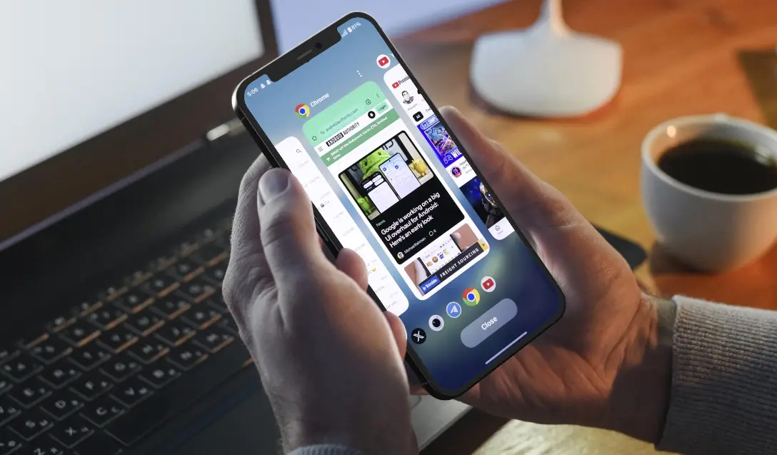
We live in the scroll. The tap. The dopamine drip of infinite feeds and two-second decisions. If you’re trying to sell gift vouchers in 2025, you’re not just competing with other businesses in your industry. Today, your biggest competitor isn’t the shop down the street, it’s the thumb that can’t stop swiping.
Welcome to the attention economy. In this economy, eight seconds is all you get.
By stripping away everything that doesn’t matter, and doubling down on what does. Clean design. Clear CTAs. Mobile-first flow. Because friction kills intent. In the voucher world, that means abandoned carts, missed revenue, and the worst fate of all: being forgotten.
Let’s unpack how you make those eight seconds’ count.
The Myth of the Patient Buyer
We’d love to believe people linger on our websites, reading with a glass of wine, savouring the experience. But they don’t. They’re distracted, multitasking, half-interested, and skimming with their finger hovering over the back button.
According to a Microsoft study, the average human attention span dropped from 12 seconds in 2000 to just 8.25 seconds in recent years. That’s an average. On mobile, it’s even less.
Add to that the fact that over 60% of gift voucher purchases now happen on mobile, and the picture gets clearer: you’re not just fighting for attention. You’re fighting for momentum.
That’s why the first impression matters more than ever.
Litmus Test: 3 Seconds, 3 Questions
Open your voucher page. Look at it for three seconds. Now ask:
- What is this?
- Who is it for?
- What do I do next?
If you can’t answer all three clearly and confidently, neither can your customers. Then they’re gone.
People don’t want to be sold to. They want to solve a problem: a last-minute gift, a meaningful gesture, a way to support a local business. Your job is to remove any cognitive load that gets in their way.
Layout That Converts: Stop Designing for Desktops
Most voucher pages are still designed with a desktop-first mentality. But your buyers are holding their phones sideways in bed at 11:42pm, squinting at bad typography and tiny buttons.
Design for them. That means:
- One CTA above the fold.
- Simple, vertical layout.
- Readable fonts.
- High-contrast buttons.
Every element should guide the buyer forward, or it doesn’t belong.
The CTA Isn’t Just a Button, It’s a Moment
“Buy Now” is fine.
“Give the Gift of a Night Off” is better.
CTAs don’t just drive action; they create emotional triggers. Emotions drive conversions. Research shows that emotionally charged headlines perform 70% better in A/B tests than neutral ones. Your CTA should do more than instruct. It should evoke.
That might mean:
- “Treat Someone Special Today”.
- “Send Instant Joy”.
- “Make Their Weekend Unforgettable”.
Great CTAs aren’t luck. They’re crafted, tested, and tuned to convert.
Speed Wins: Load Time and Flow
Here’s where the data gets brutal:
- Every extra second of load time can drop conversions by 7%.
- Mobile sites that load in 5 seconds or less earn 2x more revenue than slower sites.
If your voucher checkout takes too long to load or forces users through multiple clunky steps, you’re bleeding sales.
A platform like HyperGift solves this by:
- Eliminating unnecessary form fields.
- Offering Apple/Google Wallet integration.
- Automating confirmation and delivery.
It’s not impatience, it’s optimisation. They value their time, so should you.
The Trust Triggers That Actually Work
In an attention economy, trust must be earned quickly. You don’t need paragraphs of testimonials. Just a few well-placed credibility cues:
- 5-star ratings with quick reviews.
- Social proof (“Over 10,000 vouchers sold”).
- Secure checkout badges.
- Delivery promise (“Instant email or schedule later”).
Trust is what makes someone click “Buy” without opening a new tab to check your Google reviews.
Why HyperGift Is Built for This Moment
If this all sounds like a lot to juggle, that’s because it is, unless you’re using the right tools. HyperGift was designed from the ground up for the speed, clarity, and experience today’s voucher buyer’s demand. It takes everything we’ve unpacked in this article and takes it into one seamless platform.
With HyperGift, your voucher store is:
- Mobile-first by default, not as an afterthought.
- Built to convert with clean layouts and high-performing CTAs that are customisable.
- Fast-loading and friction-free, with integrated wallet functionality.
- Flexible for campaigns, whether it’s a seasonal rush or evergreen flow.
You don’t have to be a designer, developer, or UX strategist to compete in the eight-second economy. You just need the right platform that makes smart decisions for you, so your buyers get what they want, fast.
HyperGift helps you capture attention, hold it just long enough, and turn it into revenue.
Attention Is a Privilege, Not a Given
Your customers don’t owe you their attention, they lend it to you. Briefly. On a tiny screen. Probably while juggling three other things.
The businesses that sell vouchers fastest aren’t the ones shouting the loudest. They’re the ones who design with clarity, intention, and empathy. They respect the clock. They make the path to purchase obvious, frictionless, and worth finishing.
In a world of eight-second decisions, simplicity is the ultimate competitive edge. Strip it back. Speed it up. Say less. Mean more.
If you had their attention for just eight seconds, would your page earn the sale?
With HyperGift, you don’t have to wonder. It’s built for speed, mobile-first design, and a frictionless checkout that turns glances into purchases—without the clunky steps or slow load times that lose customers.

